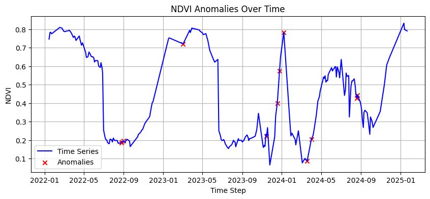
A sugarcane field's NDVI curve is a saw-tooth: it climbs after planting or ratoon regrowth, plateaus, then drops at harvest. Everything a manager wants to know about the field's behavior is in the shape of that tooth.
- Client
- Turing Agro product line - validated on CMAA farms (Usina Vale do Tijuco) and an agriscience trial plot
- Industry
- Agriculture · Sugar & ethanol
- Problem
- Per-field history (planting, cut dates, cycle length, yield) lives in spreadsheets that lag the field; nothing derives it from imagery
- Solution
- Three time-series products on Sentinel-2: crop growth cycle detection from smoothed NDVI derivatives, season start/end detection across five seasons of history, and a sugarcane yield forecaster rebuilt from a public ESALQ baseline with an honest account of what remote data can and cannot recover
- Stack
- Sentinel-2 via Google Earth Engine · daily gap-filled NDVI series · smoothing + first-derivative change detection · local-minima filtering · cloud handling · Random Forest yield regression · weather and water-deficit covariates
- Status
- Growth detection in production; season detection in test on Farm 10002; yield forecast in research (July 2025)
A sugarcane field's NDVI curve is a saw-tooth: it climbs after planting or ratoon regrowth, plateaus, then drops at harvest. Everything a manager wants to know about the field's behavior is in the shape of that tooth. The obstacles are practical: clouds create gaps, images arrive on irregular dates, and small wobbles look like events if the series is read naively.
An earlier approach used an Isolation Forest over many engineered variables. It worked on the property it was tuned for and was painful to move to a new region. The redesign goal was to make it simple enough to run anywhere.
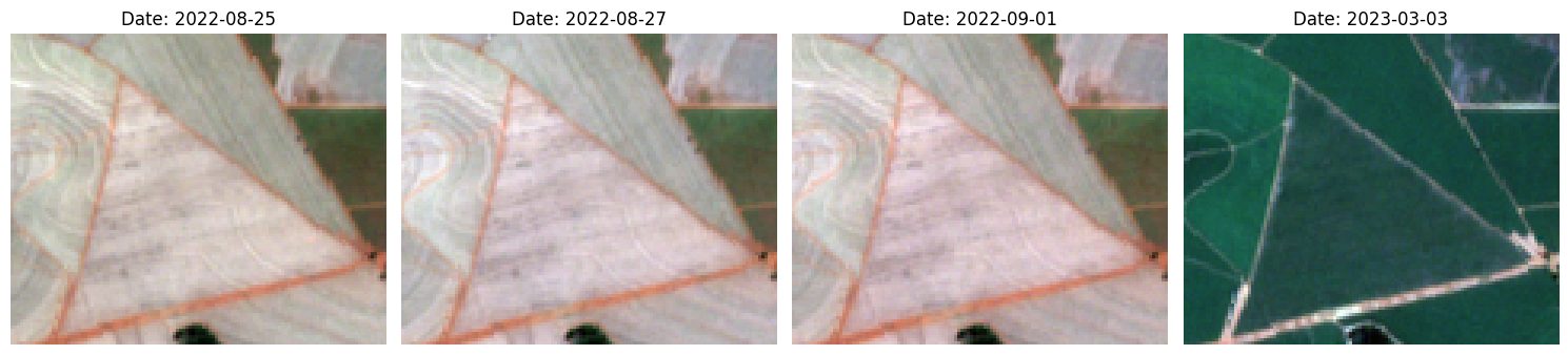
- Automatic detection of growth cycles per field, transferable across regions with no re-tuning
- Season start and harvest dates per field going back several seasons
- A way to spot anomalous fields by comparing neighbors on the same farm
- A yield forecast that uses only data collectable for an arbitrary region
- Growth-cycle detector with a fixed, small parameter set
- Five seasons (2021–2025) of start/end dates per field on Farm 10002 (96 fields)
- A yield model trained end to end on collectable data, with a known accuracy ceiling
- 01
Growth cycles from the first derivative
The redesigned detector has four steps: build a daily series by filling the days without imagery; smooth it to remove small variations; take the first derivative and find its large excursions; read the growth phases off those excursions. No training, no regional parameters.
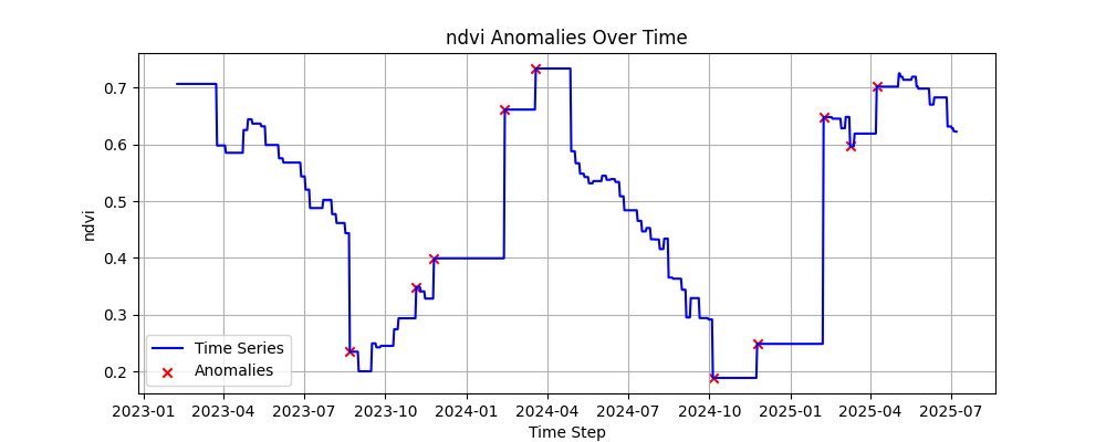
Fig. 03. Two seasons of a field, daily-filled and smoothed. Red marks are where the derivative jumped: growth onset and harvest. 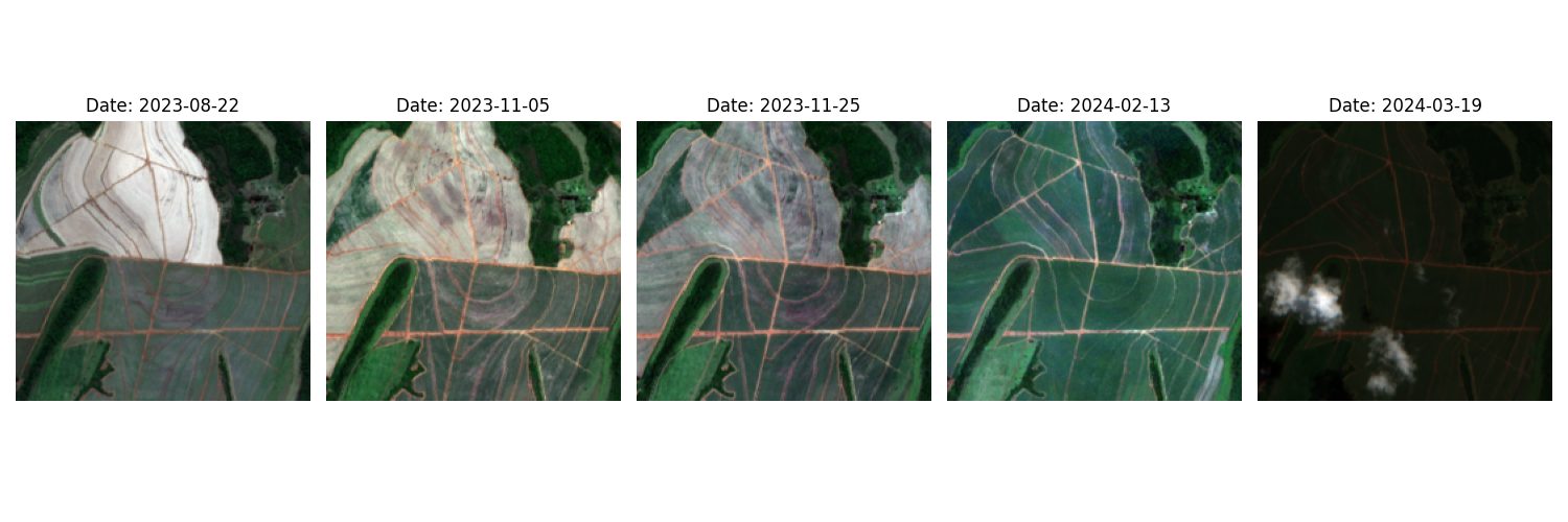
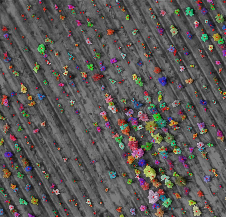
Fig. 04. The detected dates, in imagery, 2023–2024. The events line up with visible change on the ground. 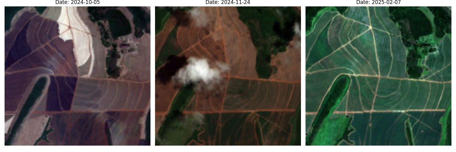
Fig. 05. 2024–2025. A cloud sits in one frame; the gap-filling keeps the series continuous through it. 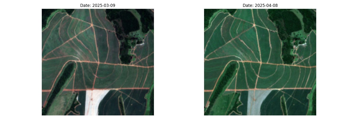
Fig. 06. 2025. 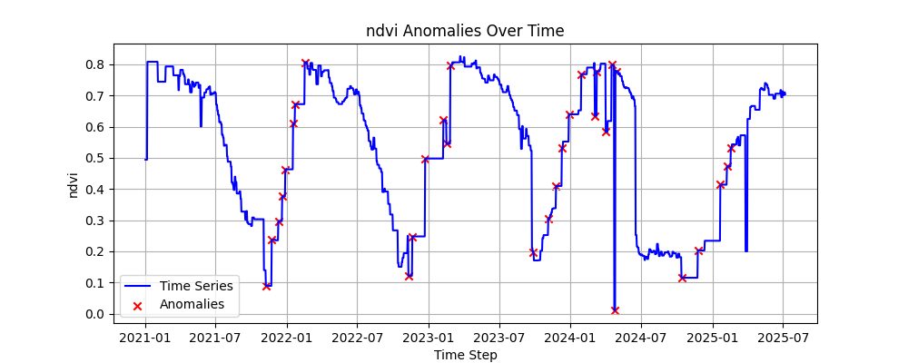
Fig. 07. Extended to the full 2021–2025 history. Each tooth is a cycle; each red point is a date the field changed state. - 02
Season start and end, per field
Knowing when each field starts and is cut enables the comparisons a manager actually makes: fields on the same farm against each other, cuts made after vigor indices had already declined, and other land-management patterns. The pipeline ingests Sentinel-2 from 3 January 2021 to 11 July 2025 and segments the series into seasons.
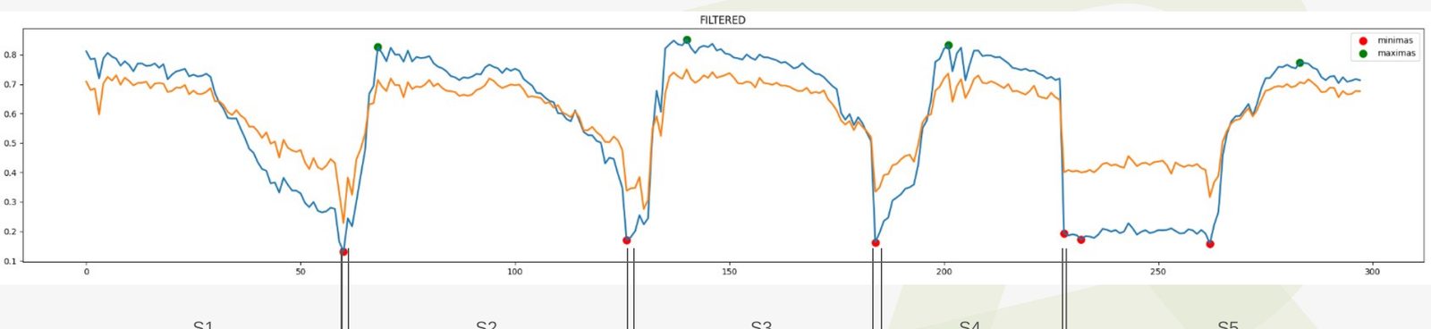
Fig. 08. Five seasons, S1 to S5, separated automatically on one field. The lower panel is the secondary index used to confirm the cut. 
Fig. 09. The pipeline in test: candidate minima before filtering. Remaining work was filtering local minima, handling clouds, and running the full 96-field farm before opening the PR. - 03
Yield forecast: rebuilding a public baseline
The starting point was a public ESALQ/USP model for sugarcane yield (TCH) built on Google Earth Engine and Random Forest, using data from the last four months of harvest. The baseline shipped a pre-trained model and a test set, but not the training set. Three constraints followed: only the test set was available, so alternative models could not be trained on the original data; there was no way to inspect training errors; and applying the model to a new region required collecting the same inputs for that region and mapping the test rows to polygons on a map. The model was retrained on the available data to establish what could be reproduced, then again using only variables collectable through GEE (satellite and weather), dropping cane variety and harvest stage, which cannot be obtained remotely, and treating water deficit as possibly collectable.
Fig. 10. The ESALQ baseline: sugarcane yield prediction using remote sensing and machine learning. 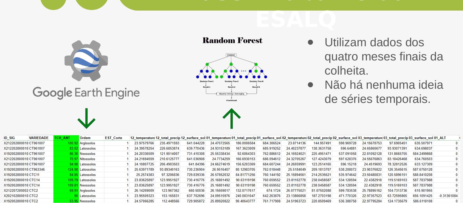
Fig. 11. Its structure: features from GEE, a Random Forest, a spreadsheet of per-field variables. No time-series notion; only the last four months. 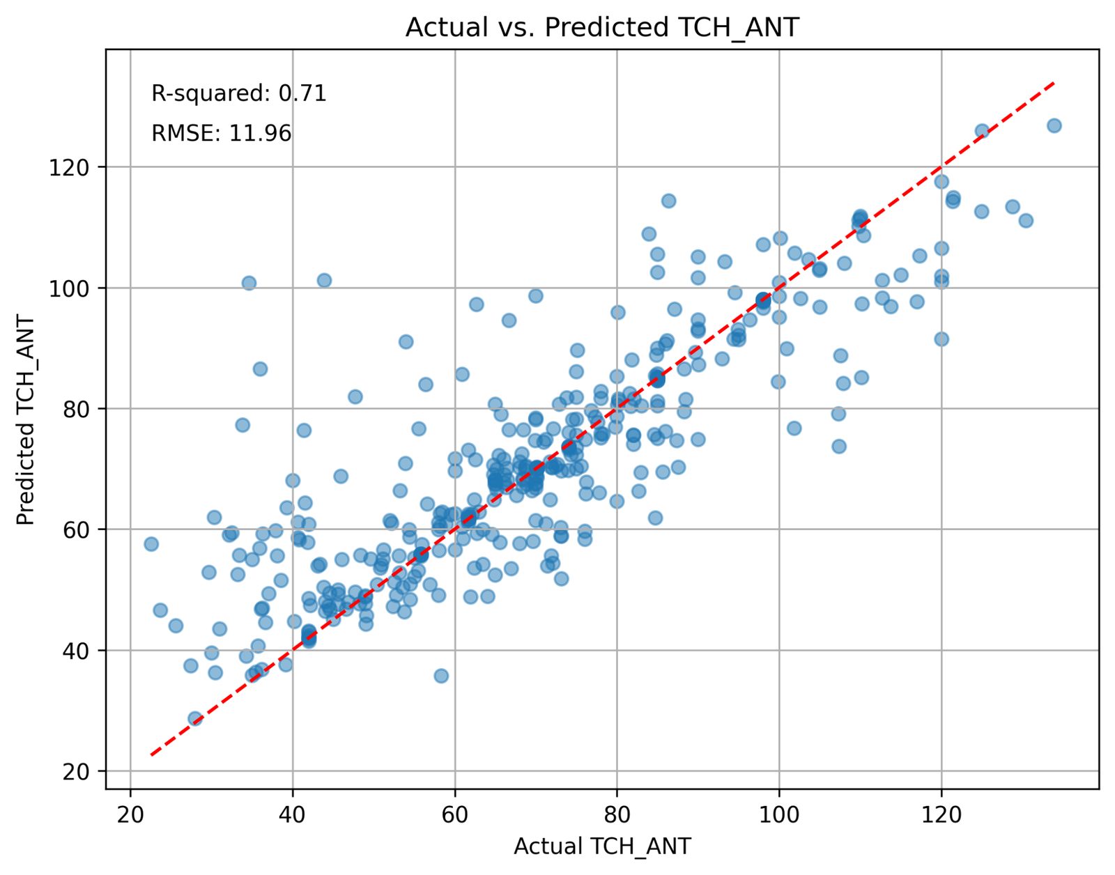
Fig. 12. The baseline on its own test set: R² 0.71, RMSE 11.91. 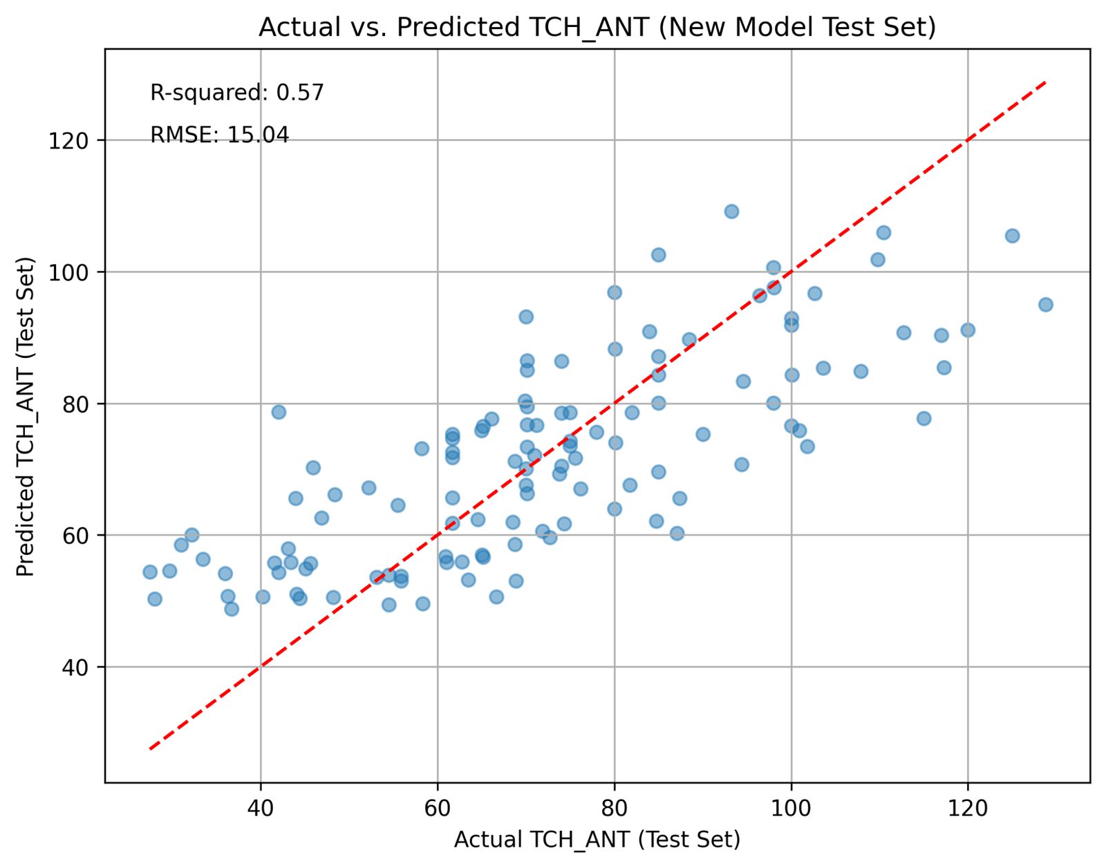
Fig. 13. Retrained on the available rows: R² 0.61, RMSE 13.06. The cost of a smaller training set. 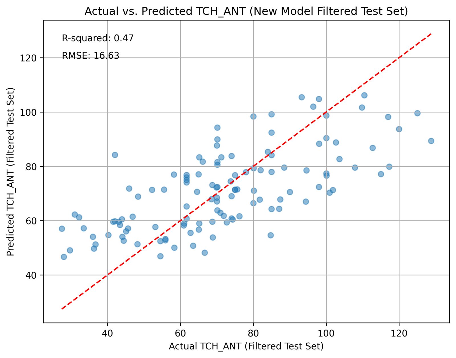
Fig. 14. Collectable variables only: R² 0.47, RMSE 14.83. This model can be applied to any region, given the final harvest month. That portability is worth the accuracy it gives up. 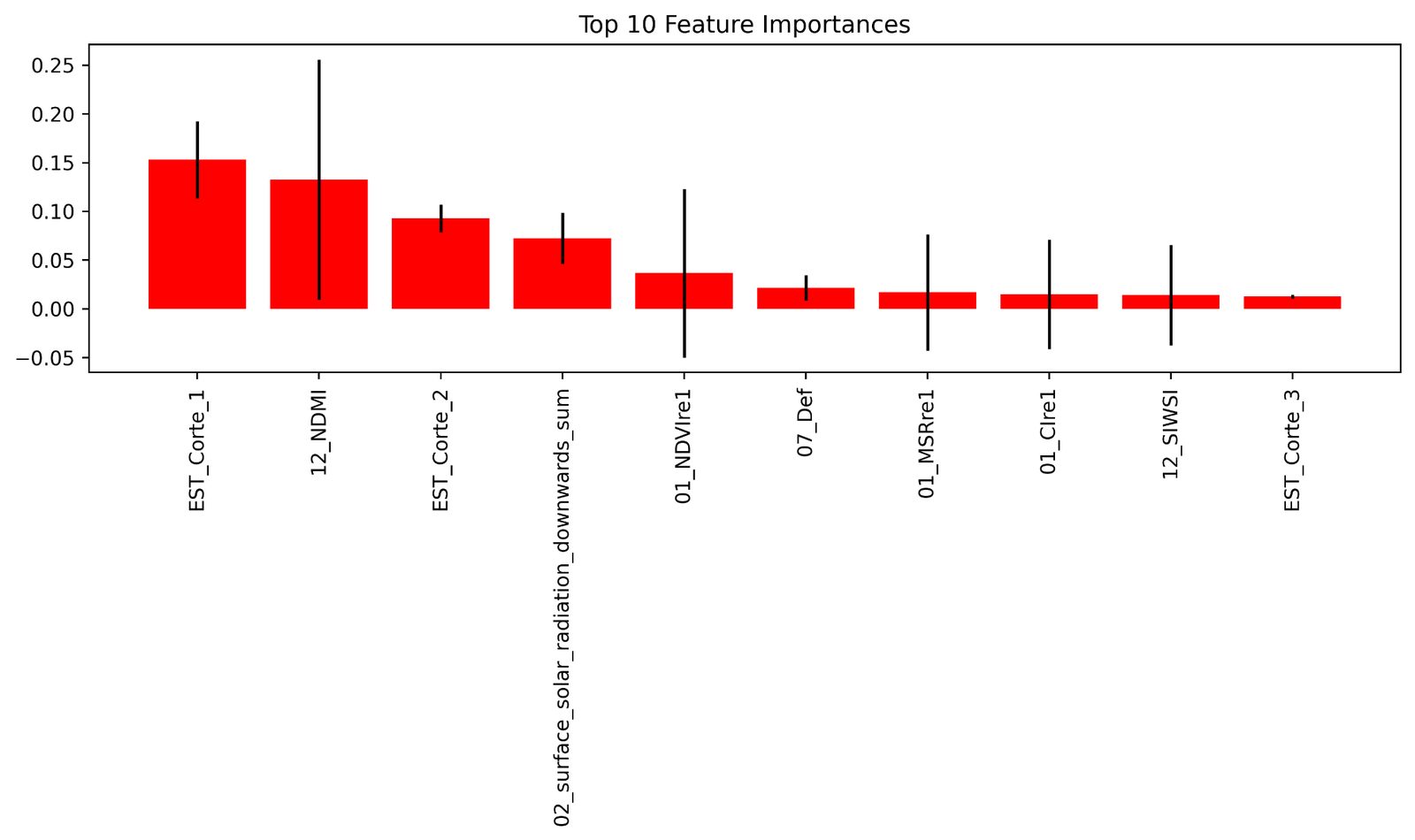
Fig. 15. Water deficit is the most important variable, and the one whose collection instructions were least clear. That became the first research front; the second was mapping the test rows to map polygons so index history could be added as a feature.
- Replacing a many-variable anomaly model with a derivative-based detector that needs no regional tuning
- Daily gap-filling and smoothing before any event logic
- Rebuilding the yield baseline step by step so every drop in R² has a named cause
- Preferring a portable model with a known ceiling over an accurate one that only works where it was trained