A sugarcane mill logs a great deal: hectares cut per hour per operator, liters of diesel per refuelling, RPM, event codes for every stop, tons entering the gate. None of it is organized to answer the question a fleet manager actually asks at the end of the month: who, and which machine, is consistently worse than the others doing the same job on the same ground?
- Client
- Ipiranga Agroindustrial - sugarcane group, four mills
- Industry
- Agriculture · Sugar & ethanol
- Problem
- Low-performing operators and machines were only found after the season closed, if at all
- Solution
- Two complementary detectors: a statistical field-by-field ranking that flags chronic underperformers, and a Random Forest "expected performance" model that flags every entry outside the model's error margin
- Stack
- Operational yield + event logs (2023–2024) · refuelling records (2023–2025) · mill intake (2021–2025) · scikit-learn RandomForestRegressor · statistical thresholding · monthly alert reports
- Delivered as
- MVP report, April 2025
A sugarcane mill logs a great deal: hectares cut per hour per operator, liters of diesel per refuelling, RPM, event codes for every stop, tons entering the gate. None of it is organized to answer the question a fleet manager actually asks at the end of the month: who, and which machine, is consistently worse than the others doing the same job on the same ground?
The naive answer (rank everyone by ha/h) is wrong. Yield depends on the field, the crop, the day, the process. A good operator on a bad field looks worse than a bad operator on a good field. The comparison has to be controlled.



- A monthly list of operators and machines performing below what the same field would predict
- Enough statistical backing that a supervisor could take it into a conversation
- The same method for people and for equipment
- A worked economic case on at least one flagged machine
- Two performance indicators tracked: operational yield (ha/h) and fuel consumption (L/h)
- Alerts issued per operator, per equipment, per month
- Model error low enough that "outside the margin" means something (achieved: R² 0.97, SMAPE 3.9%)
- A quantified savings case on a real flagged machine
- 01
Look at the statistics before the AI
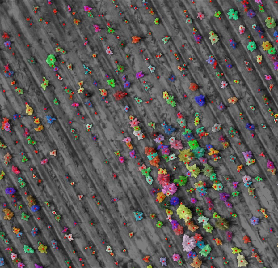
Before any model, the data was profiled to decide where to spend effort. Initial decisions: focus on cane cutting, focus on the CH 570, and run two approaches side by side.
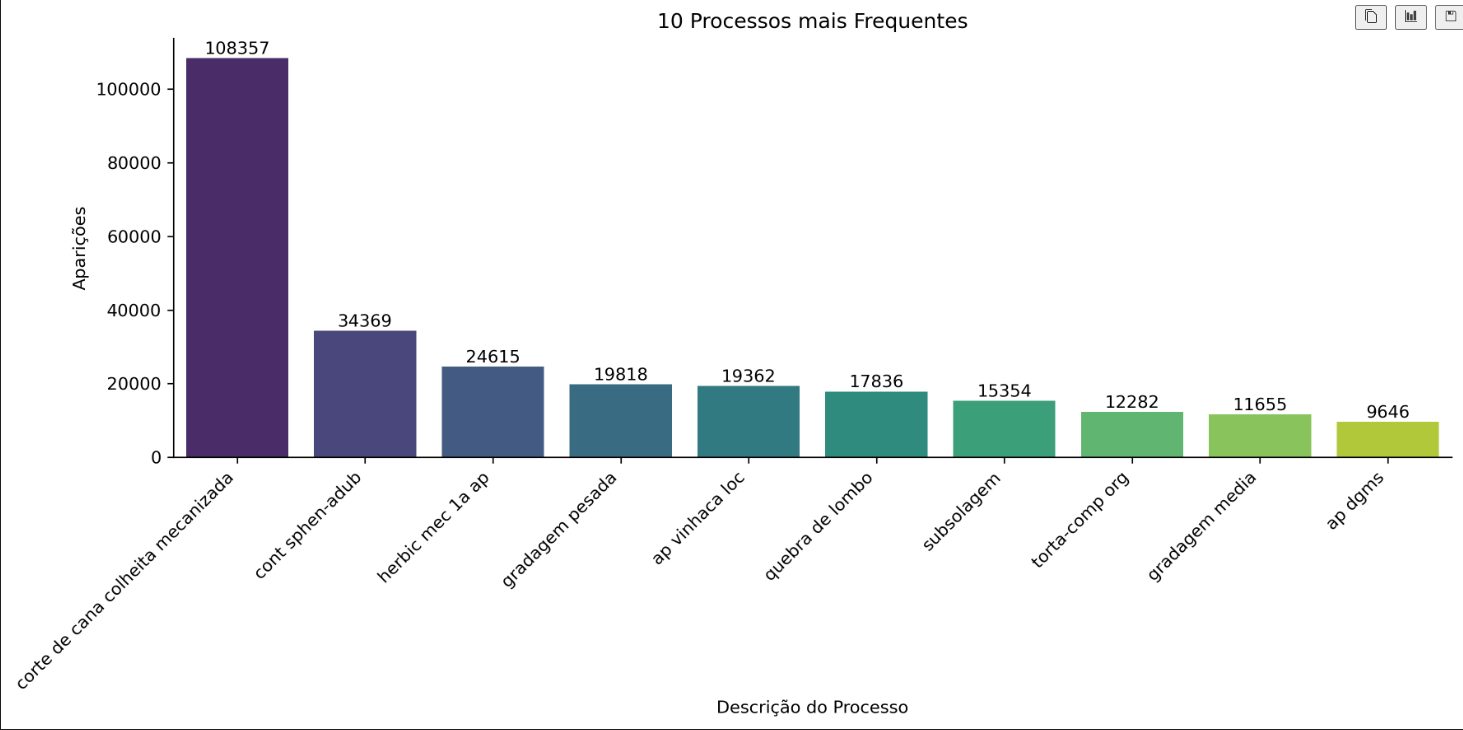
Fig. 04. Cane cutting dwarfs every other process in the logs. Focus there first. 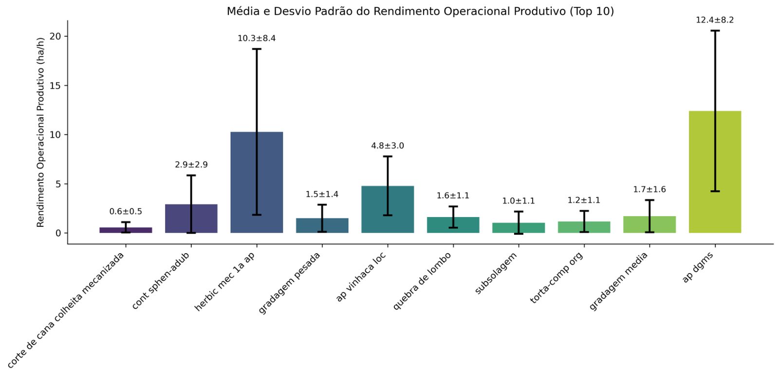
Fig. 05. Yield per process. The standard deviation on cane cutting is large: that spread is the improvement room. 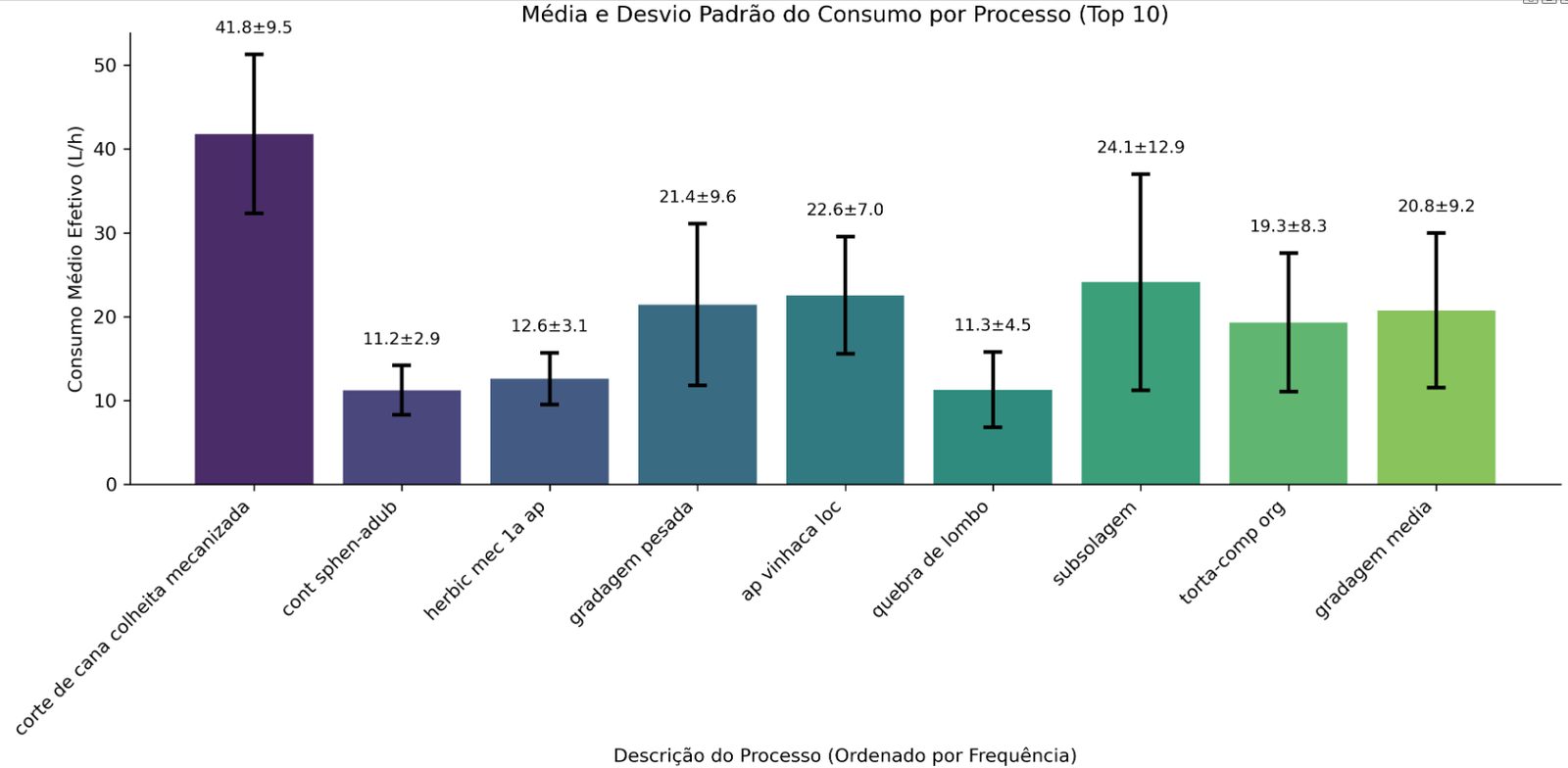
Fig. 06. Fuel per process. Same story: cutting is both the highest consumer and the most variable. 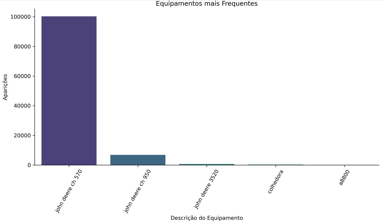
Fig. 07. One harvester model, the CH 570, is by far the most common. Start with a homogeneous fleet. 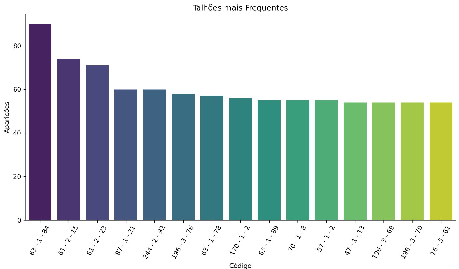
Fig. 08. No field dominates. Filtering by field would not simplify anything, so fields become a control variable instead. 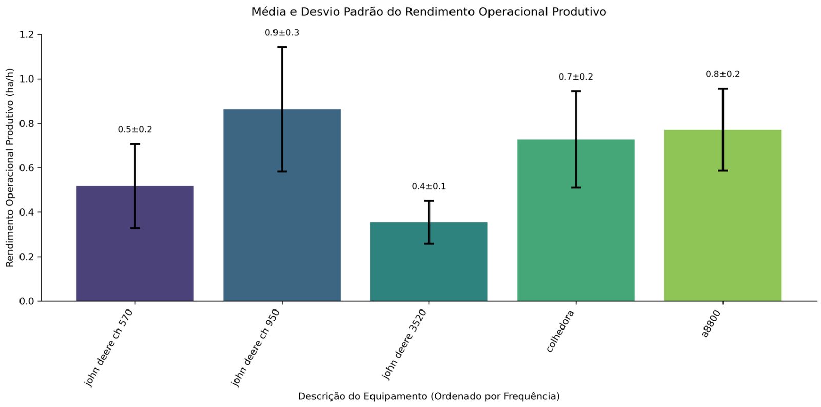
Fig. 09. Yield per machine model. 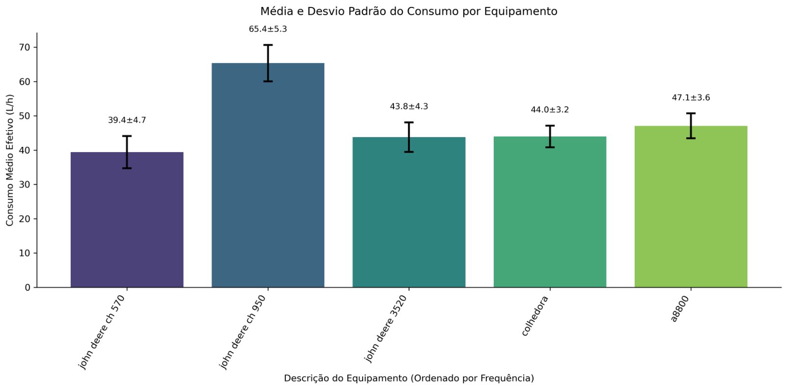
Fig. 10. Fuel per machine model. Both spreads are wide enough to justify an operator-level look. - 02
Approach 1 - statistical ranking within the same field
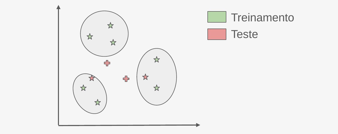
For each field, period, and farm, agents (operators or machines) are ranked by yield or by fuel. The method counts how often each agent was the worst of its ranking, then tests whether that count is above what chance would produce. If it is, an alert is issued.
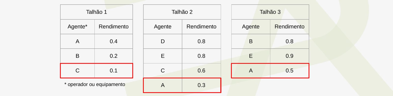
Fig. 11. The method in miniature: across three fields, C is last once and A is last twice. The test decides whether twice is too many. 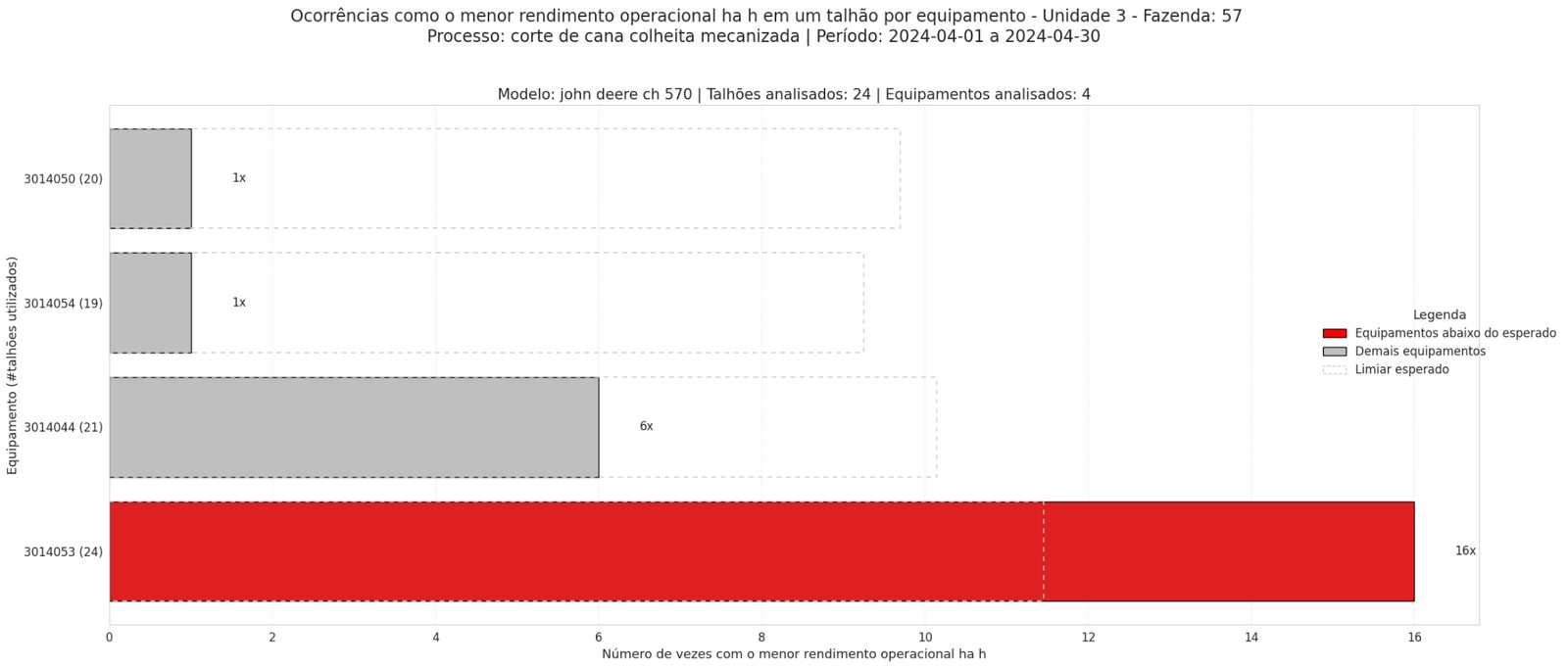
Fig. 12. Equipment 3014053 was the worst of its ranking in 16 of 24 fields. The threshold line is the maximum a machine can be last without triggering an alert; this one clears it easily. 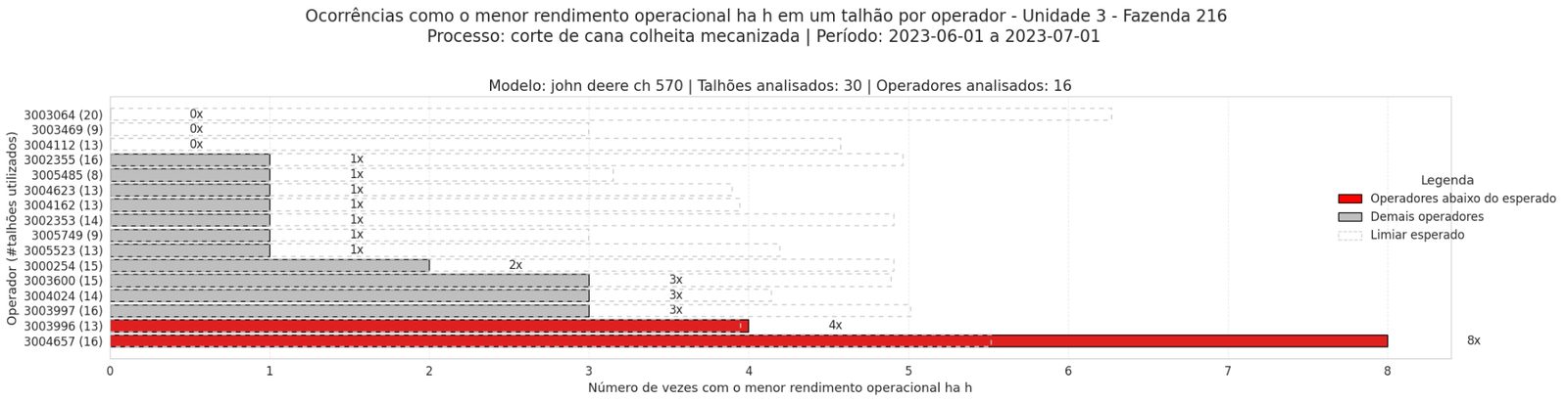
Fig. 13. June 2023, one farm: two operators flagged below expected yield. 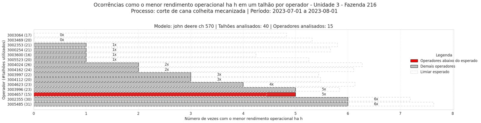
Fig. 14. July 2023, same farm: one of them is flagged again. Persistence is what makes the alert actionable. - 03
The worked example: equipment 3014053
The same machine was flagged for fuel consumption above expected in three consecutive months. If 3014053 had matched the average consumption of its peers over those three months, it would have burned roughly 3,144 liters less. At R$ 6.00/L that is ~R$ 18,864 for one machine, one quarter. Extrapolated to a 240-day harvest: ~R$ 50,304. The detector would have caught it in May.
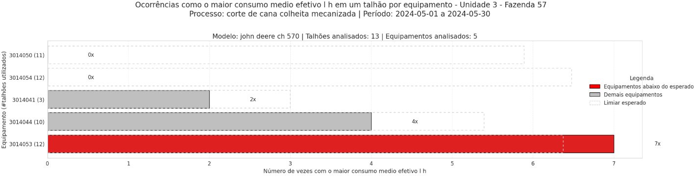
Fig. 15. May 2024: consumption alert. 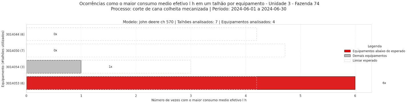
Fig. 16. June 2024: still flagged. 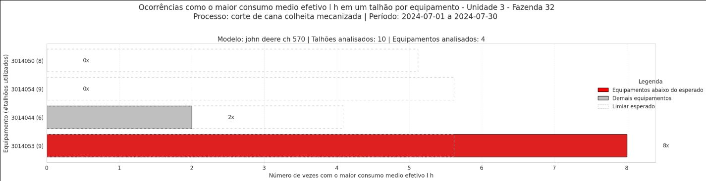
Fig. 17. July 2024: third month in a row. 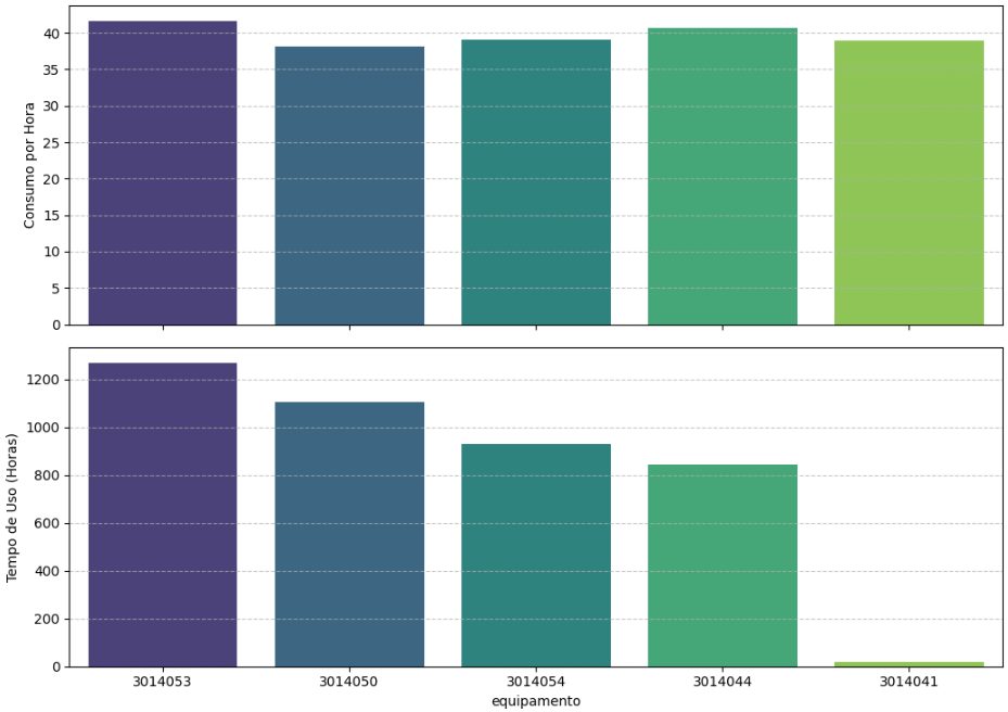
Fig. 18. Against machines that worked the same fields: 3014053 consumed more per hour and was also used for more hours, which compounds the loss. 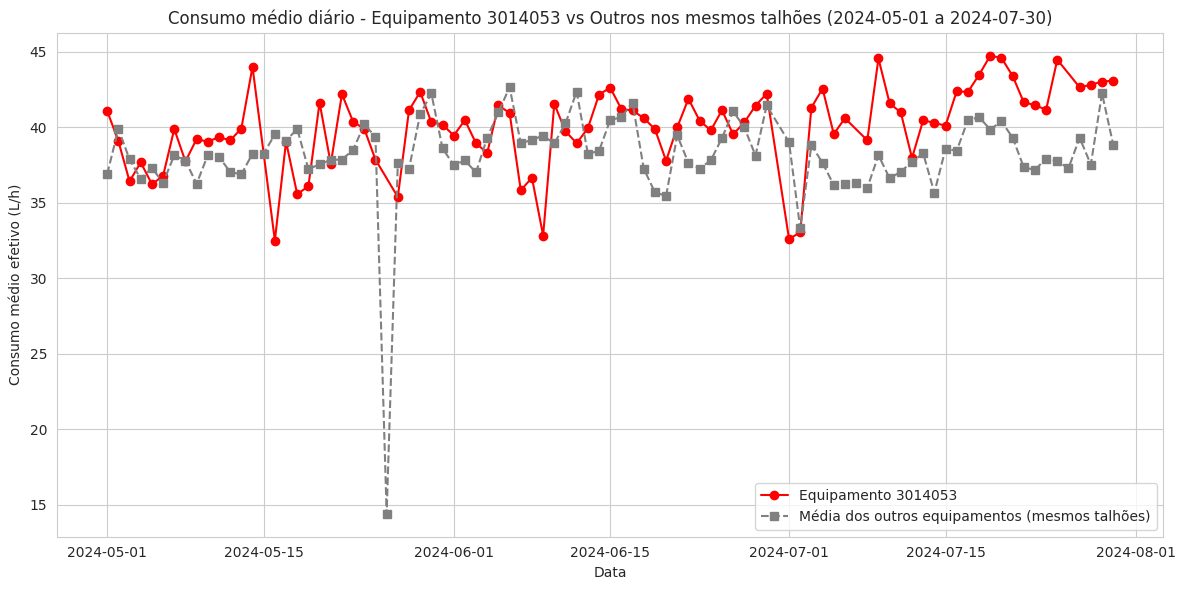
Fig. 19. Daily average consumption. The gap to peers opens in May and widens in July. 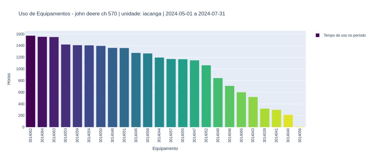
Fig. 20. Fourth most-used machine in Iacanga over the period. A problem on a busy machine is worth more than a problem on a parked one. - 04
Approach 2 - predicted performance with AI
The second detector inverts the question. Instead of ranking, it learns what performance should have been for every entry (given field, process, machine, day, and the rest) while hiding the operator, then compares actual to predicted. Entries outside the model's error margin are the anomalies; agents that are repeatedly outside it are the alerts. Next steps identified: tighter models shrink the margin and expose more opportunities; explainability methods show why an entry was flagged; and the expected-versus-realized pattern generalizes to any operation with a log.
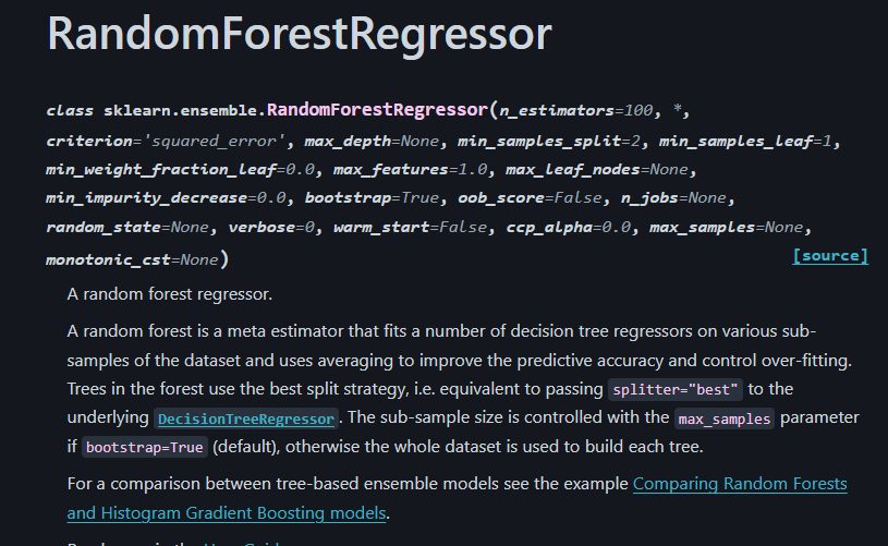
Fig. 21. A RandomForestRegressor. Boring on purpose: it handles mixed categorical and numeric inputs and is easy to explain. 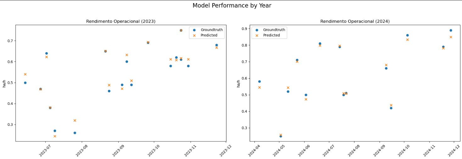
Fig. 22. Model performance: MSE 0.0007, SMAPE 3.91%, R² 0.9715. The margin of error is tight enough that a miss is informative. 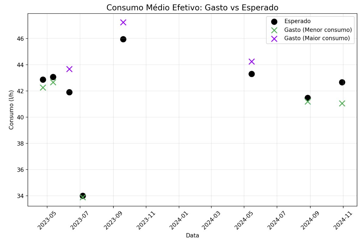
Fig. 23. Fuel: predicted versus realized. Points above the band are entries that spent more than the field explains. 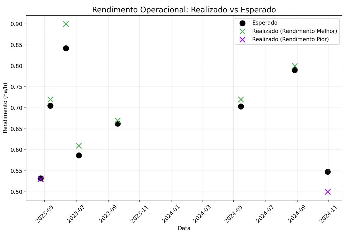
Fig. 24. Yield: predicted versus realized. Points below the band are entries that produced less than the field explains. 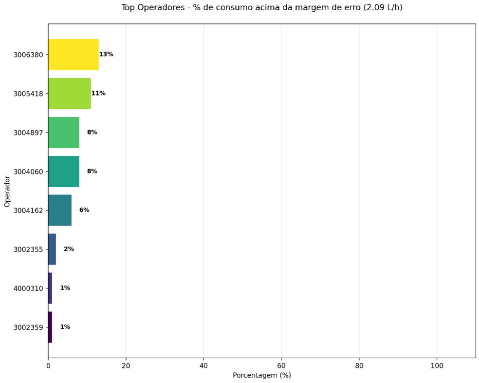
Fig. 25. Per operator: share of entries with fuel outside the margin. Some operators overspend in up to 13% of their entries. 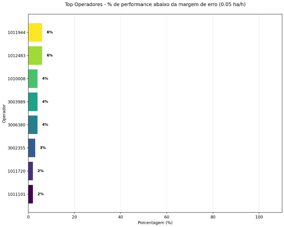
Fig. 26. Per operator: share of entries with yield below the margin, up to 6%. 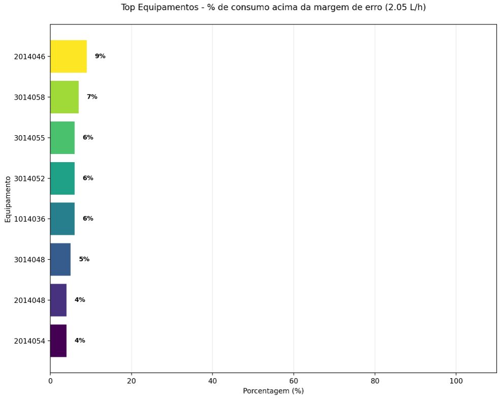
Fig. 27. Same method, same model, applied to equipment: overspend in up to 9% of entries. 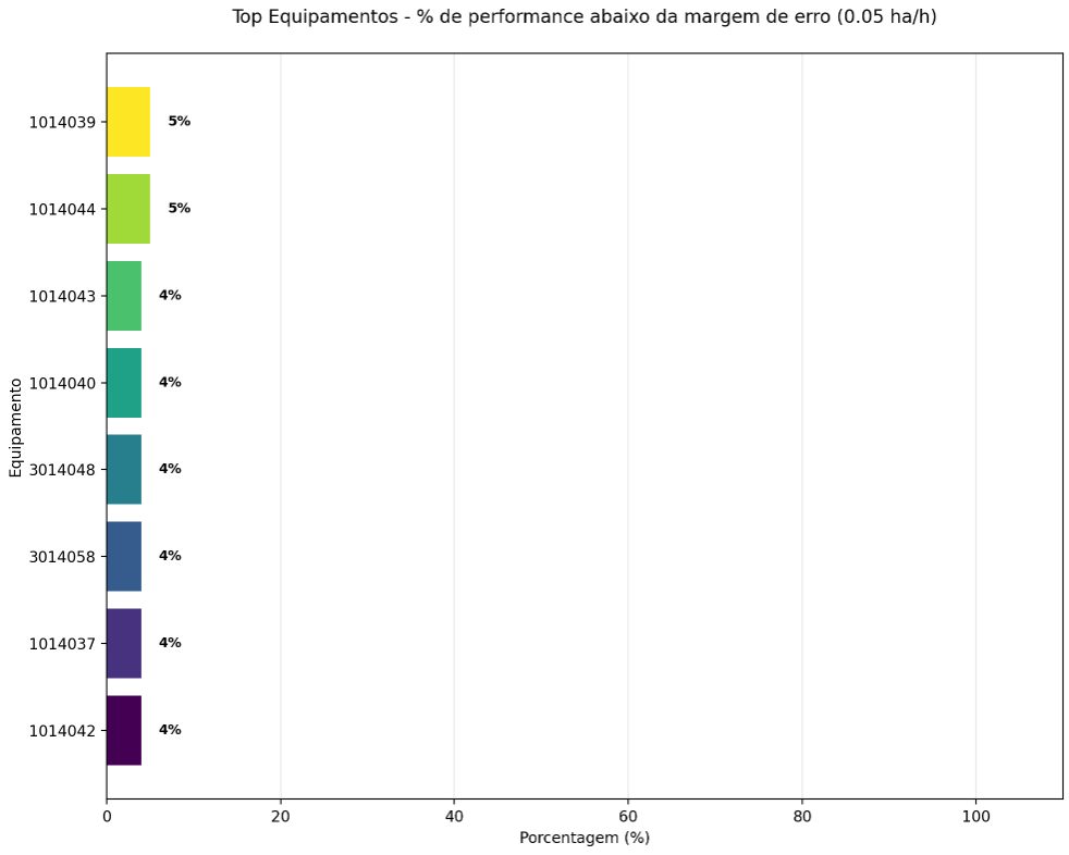
Fig. 28. Equipment yield below margin, up to 5%. 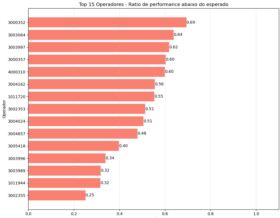
Fig. 29. The full operator list from the first iteration of the model. 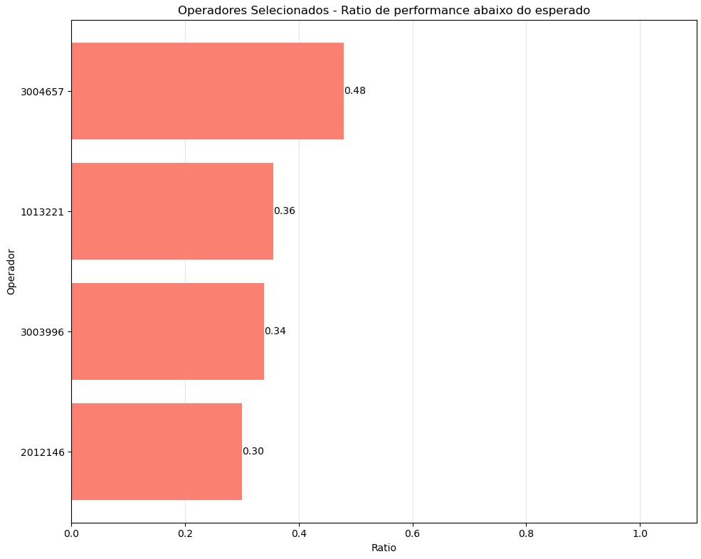
Fig. 30. The short list. This is what the supervisor gets.
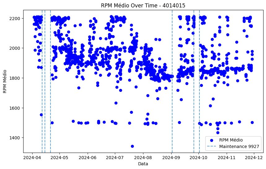
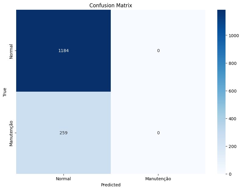
The client also asked for maintenance prediction. We tried, and the honest result is that the data was not there yet.
The reason is structural: none of the available signals describe what sends a machine to the workshop. Engine temperature, engine hours and idle hours, lubricant consumption, and similar telemetry would. That is the instrumentation gap, and naming it is more useful to the client than a model that pretends.