CMAA's focus was one word: productivity. The mill logs operations by sector, activity, operator and machine, but the log answers "what happened" and not "what usually happens when it goes well." Managers wanted three things the log alone could not give: a forecast of low days, an alert when one was forming, and a reference for what a good day looks like per activity and sector.
- Client
- CMAA - Companhia Mineira de Açúcar e Álcool (Usina Vale do Tijuco)
- Industry
- Agriculture · Sugar & ethanol
- Problem
- Productivity fluctuated day to day and the reasons stayed anecdotal; low days were explained after the fact, never predicted
- Solution
- A productivity analytics layer: attribution of what drives low-productivity days, a daily/weekly alert stream to WhatsApp and e-mail, trend detection per operator and machine, idle-time attribution, and NLP over corrective-maintenance service orders
- Stack
- Explainability and attribution methods · z-test quantile analysis · trend regression with cyclic components (linear regression, mixed models, Fourier) · anomaly inference (K-Means, PCA, Isolation Forest) · service-order text processing · WhatsApp / e-mail notifications · Turing Agro app
- Engagement
- Weekly working sessions to align expectations and present results
CMAA's focus was one word: productivity. The mill logs operations by sector, activity, operator and machine, but the log answers "what happened" and not "what usually happens when it goes well." Managers wanted three things the log alone could not give: a forecast of low days, an alert when one was forming, and a reference for what a good day looks like per activity and sector.
- Analysis and prediction of productivity, not just reporting of it
- Detection of low-productivity periods early enough to intervene
- Notification of unproductive events to the people who can act, on the channel they already use
- A reference profile per activity: what the best operators and machines actually take to do each job
- Daily and weekly low-productivity alerts delivered to WhatsApp and/or e-mail
- Attribution of the main features associated with low productivity
- A productivity guide (an empirical "ruler") per activity and sector, built from the most productive people and machines
- Operation maps and profiles usable as references for future execution
- 01
Attribution: what a low day is made of
Explainability and attribution methods were applied to the daily productivity model to surface the features most associated with low days. The output is not a black-box score but a ranked list of contributing conditions per period. From the same data, execution times for each activity type in each sector were recorded and used to build a productivity guide from empirical observation of the most productive operators and machines. Operation maps and profiles derived from those references become the standard for future execution.
- 02
Predicting high- and low-productivity periods
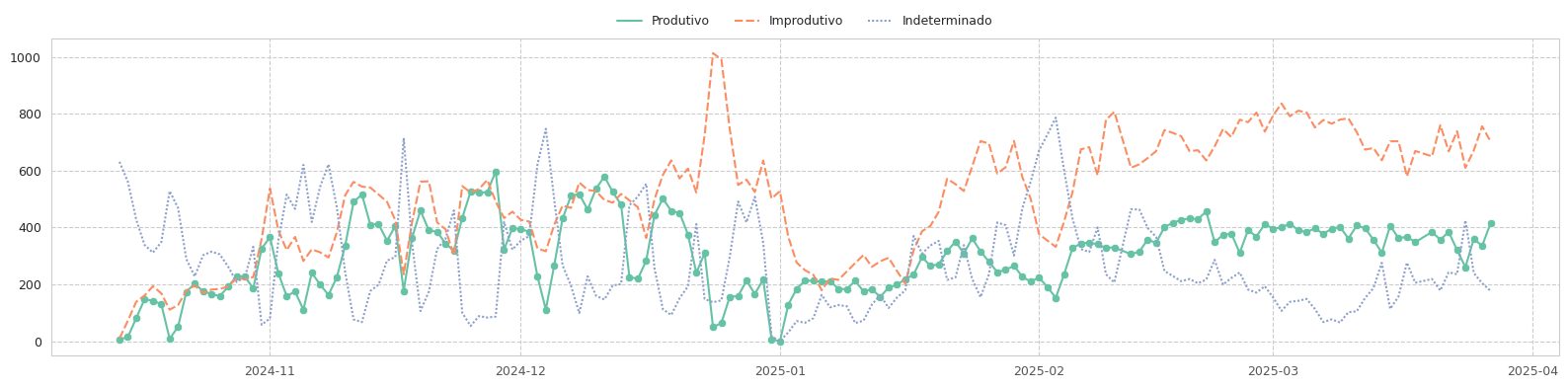
Three families of methods run on the daily series: Quantile analysis based on statistical tests (e.g. z-test) to define "low" objectively Trend regression and learning of cyclic components (linear regression, mixed models, Fourier analysis) so weekly and seasonal rhythms are not mistaken for problems Anomaly inference by machine learning (K-Means, PCA, Isolation Forest) for the days that neither trend nor cycle explains
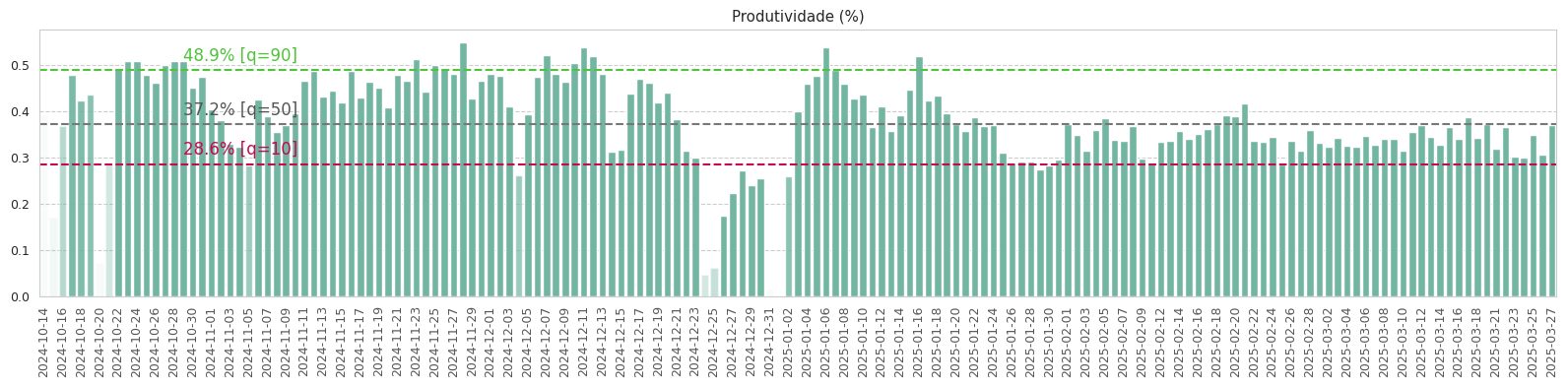
Fig. 02. Days flagged as low productivity. Each flag becomes a daily or weekly alert with the top attributed causes. - 03
Trend per operator and machine
Beyond single bad days, the system fits a trend per operator and per equipment and flags the ones sliding downward, so a supervisor sees a trajectory rather than an isolated number.
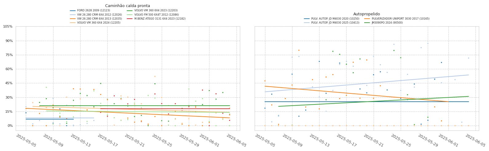
Fig. 03. Trend lines per operator. The highlighted one is drifting down over weeks: a training conversation, not a reprimand. - 04
Notifications
Alerts are written as short natural-language reports and pushed to WhatsApp and e-mail. The content is what a manager would ask for in the morning meeting: which day, which sector, which activity, how far below reference, and the likely drivers.
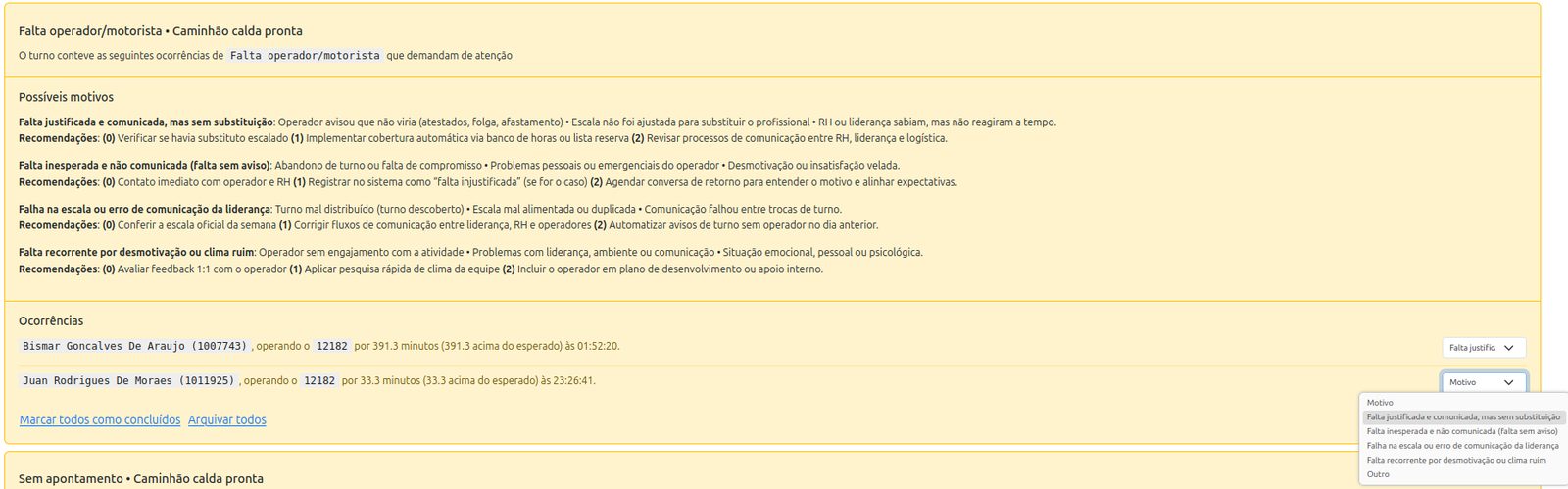
Fig. 04. A generated unproductive-event notification. Plain text, specific numbers, a recommended follow-up. 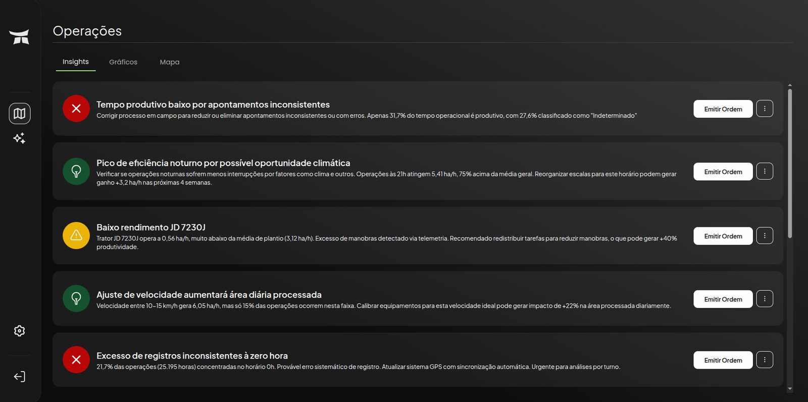
Fig. 05. The same alerts inside the Turing Agro app: an operations feed sorted by severity, each item opening into its evidence. 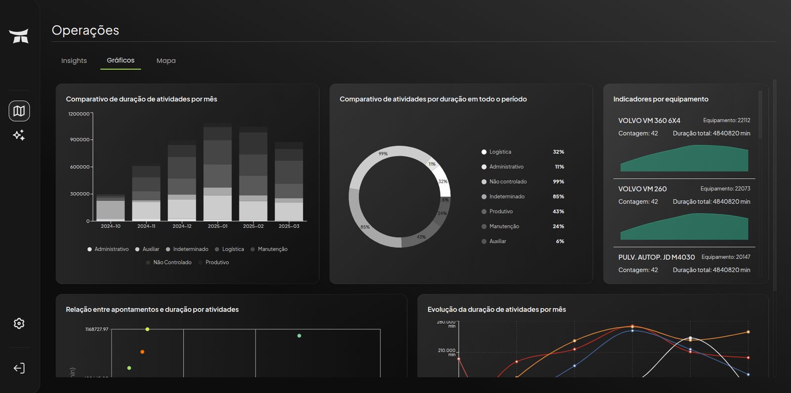
Fig. 06. The operations dashboard: the daily view of productivity, fuel, idle time and open alerts. - 05
Idle time
Idle events were grouped by their logged reason and ranked by total hours, which is the only ranking a logistics manager can budget against.
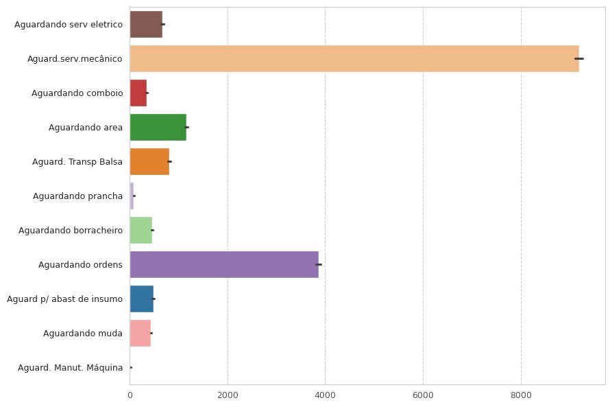
Fig. 07. Idle hours by reason. Two reasons account for most of the lost time; the rest is a long tail. - 06
Corrective maintenance, from free text
Service orders are written by mechanics in natural language. The text was processed to classify the main problem per order, and the resulting classes were charted by total maintenance time and by number of events.
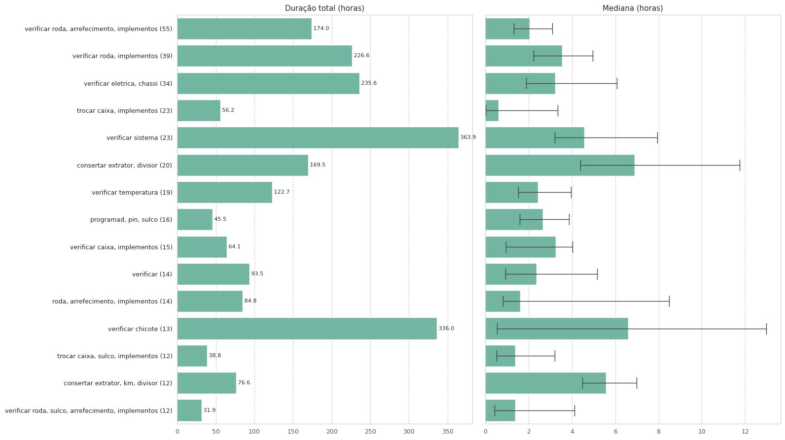
Fig. 08. Corrective maintenance by problem class, extracted from free-text service orders. Left: total hours. Right: event count. The expensive problems and the frequent ones are not the same list.
- Weekly sessions with the client's operations team, so each analysis answered a question that had been asked the week before
- Defining "low" statistically before building anything predictive
- Sending alerts where people already are (WhatsApp) instead of asking them to open another dashboard
- Treating service-order text as data, which turned a maintenance log into a prioritization tool